Versions Compared
| Version | Old Version 14 | New Version Current |
|---|---|---|
| Changes made by | ||
| Saved on |
Key
- This line was added.
- This line was removed.
- Formatting was changed.
| Anchor | ||||
|---|---|---|---|---|
|
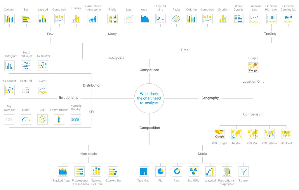
There are a very large number of chart types available in Talent Analytics, and it is important that the type that you select is appropriate for the type of data you are analysing. The diagram below has been provided to help you choose the ideal chart to use.
Click the image to open it in full screen.
 Image Removed
 Image Added
Chart Type | Sub Type | Chart Type Description | When to Use |
|---|---|---|---|
Line Chart | - | Used to compare sequential data. Categorical-based line charts may be used as an alternative to bar charts. | Overall Pattern/ Trend |
Column Chart | Vertical Bar | Also referred to as column charts. Used when individual values are important. | Comparison; Categorical Data; Breakdown; individual values through time; Frequency Distribution |
Stacked Vertical Bar | Also referred to as stacked column charts. Used when part-to-whole comparison is important. | Trend Breakdown; Sum | |
Bar Chart | Horizontal Bar | Show and compare categorical data, months, years, product categories rather than continuous time series or quantitative data. | Comparison; Categorical Data; Breakdown; Raking; Part-to-whole percentage; Frequency Distribution |
Stacked Horizontal Bar | Categorical data, grouped or stacked to assist comparison. Use when part-to-whole comparison is important. | Ratio; Trend Breakdown | |
Week Density | - | Shows the density of occurrences based on hour relative to other densities on the same day of the week. | Frequency Distribution/ Density |
Pie Chart | - | Used to show the relative size of each component to one another and to the whole. | Static Breakdown (percentage values only) |
| Panel | ||||||
|---|---|---|---|---|---|---|
| ||||||
|
| Tip |
|---|
| You can build multiple reports charts per chart report and experiment with different types or layouts until you find the chart or charts most appropriate for your needs. |