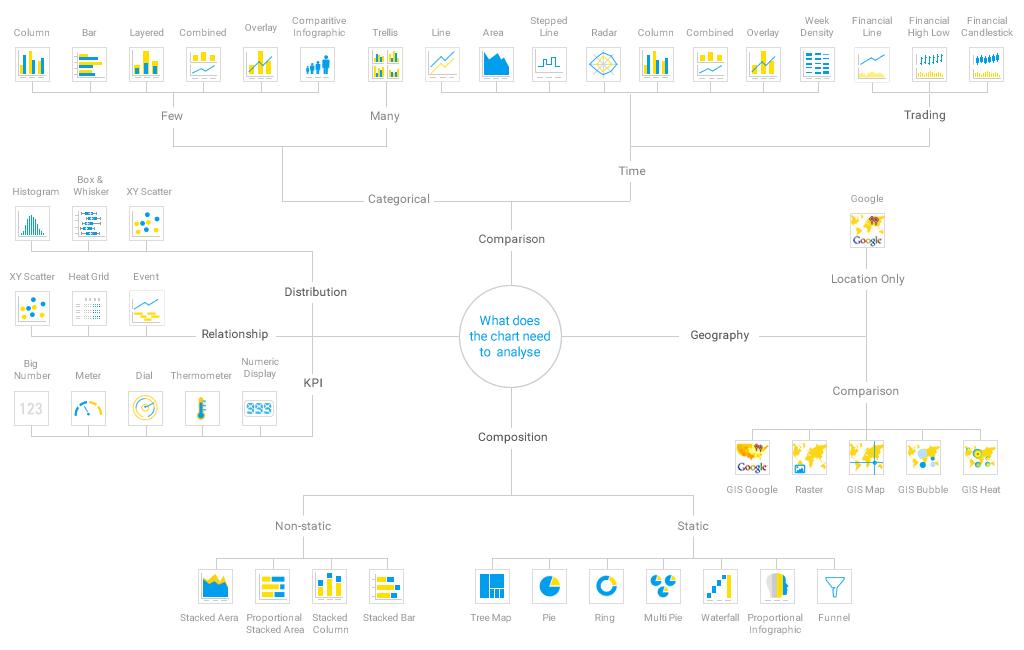
Chart Type | Sub Type | Chart Type Description | When to Use |
|---|
Line Chart | - | Used to compare sequential data. Categorical-based line charts may be used as an alternative to bar charts. | Overall Pattern/ Trend |
Column Chart
| Vertical Bar | Also referred to as column charts. Used when individual values are important. | Comparison; Categorical Data; Breakdown; individual values through time; Frequency Distribution |
Stacked Vertical Bar | Also referred to as stacked column charts. Used when part-to-whole comparison is important. | Trend Breakdown; Sum |
Bar Chart
| Horizontal Bar | Show and compare categorical data, months, years, product categories rather than continuous time series or quantitative data. | Comparison; Categorical Data; Breakdown; Raking; Part-to-whole percentage; Frequency Distribution |
Stacked Horizontal Bar | Categorical data, grouped or stacked to assist comparison. Use when part-to-whole comparison is important. | Ratio; Trend Breakdown |
Week Density | - | Shows the density of occurrences based on hour relative to other densities on the same day of the week. | Frequency Distribution/ Density |
Pie Chart | - | Used to show the relative size of each component to one another and to the whole. | Static Breakdown (percentage values only) |


